The psychology of color in store decoration is the most crucial aspect of commercial design. Colors have a direct impact on how people perceive stores. It affects the amount of time shoppers choose to spend in the store, the type of experience they have, and whether they choose to make a purchase.
According to statistics from some experts, 80% of consumers believe that using colors in retail design can increase brand recognition. Similarly, between 62% and 90% of consumers claim to have made unconscious decisions about a favorable environment within the first 90 seconds of entering a store. This suggests a design plan. At Optima Retail we can help you out on the remodelation of your retail design.
This suggests that a retail design strategy should heavily rely on the store’s color palette.
The use of color helps to create a distinctive ambiance and serves the function of communicating the brand’s personality to customers. Let’s take a look at what different colors represent and why brands are likely to use them.
Color Psychology in Store Decoration
It’s interesting to understand the cultural significance of various shades and hues for use in our retail marketing, but also the psychology of color in store decoration to develop a narrative that accurately represents us. It’s also a factor that influences purchasing decisions.
Blue
The color blue brings feelings of security, reliability, and calmness. Brands that use blue often have a serious or professional atmosphere and are likely to sell technology-related products.
yellow
Yellow brings joy, excitement, and optimism. It’s the first color people notice. It’s also a color that stimulates appetite, which explains why brands like McDonald’s use it in their logos, branding, and restaurants.
red
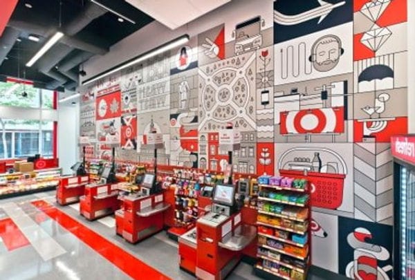
Red evokes a sense of urgency. It’s a strong color that can mean different things for different cultures. Red is often used in store designs to increase sales. Similarly to yellow, red should be used as an accent color.

white
White is a color associated with purity. It represents sincerity, minimalism, and everything contemporary. Apple is a well-known brand that uses white color both in its retail design and logo. This gives the design, along with the store layout, a very minimalist feel where the emphasis is on highlighting Apple products.
green
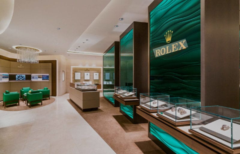
It’s used to symbolize everything related to the natural world, peace, and health. It’s a color that’s frequently used in independent stores as well as in supermarkets, cafes, and restaurants.

black
Brands use dark colors to project an air of sophistication and elegance. Cosmetic brands like MAC and Bobbi Brown utilize black in their design, logo, and packaging.
pin
Pink is associated with femininity, but this is more due to cultural tradition than anything else, as efforts are currently being made to break gender barriers based on color so that a particular gender is not identified. However, it’s a traditional practice in stores to highlight feminine products or those intended for this audience.
Color as an Effective Medium in Retail Design
One of the most important senses, sight, allows us to perceive feelings and give us a sense of space. That’s why it’s crucial to choose wisely when it comes to colors for retail. Many brands rely on them when communicating with their customers because they can affect their perception or emotions using different shades.

Color Interpretation Around the World
In various parts of the world, colors hold different meanings. In Chinese culture, the color green represents infidelity, but in Western culture, it’s a symbol of good luck.
Similarly, while black clothing is commonly worn in stores in the United States, it’s uncommon to see black clothing in stores in China, as that country doesn’t view black as an attractive tone.
Achieving the Right Color Balance
Retail stores often use a color scheme when designing their spaces. The rule is that no color should overpower any other color. This is especially true when using bright colors like red. For most designs, it’s possible to choose more serene and light colors, but it’s great if they’re complemented with bright accent colors.
Colors Come in Melodies
Color requirements vary depending on the size of the retail space and even the time of day. There’s an emerging trend in stores where the color scheme is changed to better showcase merchandise.
Stores can adjust their colors to white or all colors. Additionally, colors can be adjusted from dark to light so that the displayed merchandise is visually appealing, regardless of whether it’s day or night.

Color choice is one of the most crucial steps in the design process, according to retail designers.
Good planning is required when designing a retail space, taking into account the brand’s personality and tone, as well as customer preferences. Color choice is one of the most crucial steps in the design process.
Most importantly, in all cases, when using color in a store, it should always be used with a purpose, to avoid copying other brands and to play with the type of customer we’re trying to attract. Only then can we ensure that it serves its purpose and is the ideal complement for a properly managed retail business.


